 Agip Arzaki Maulana
Building Movement, the design system behind Jamtangan.com
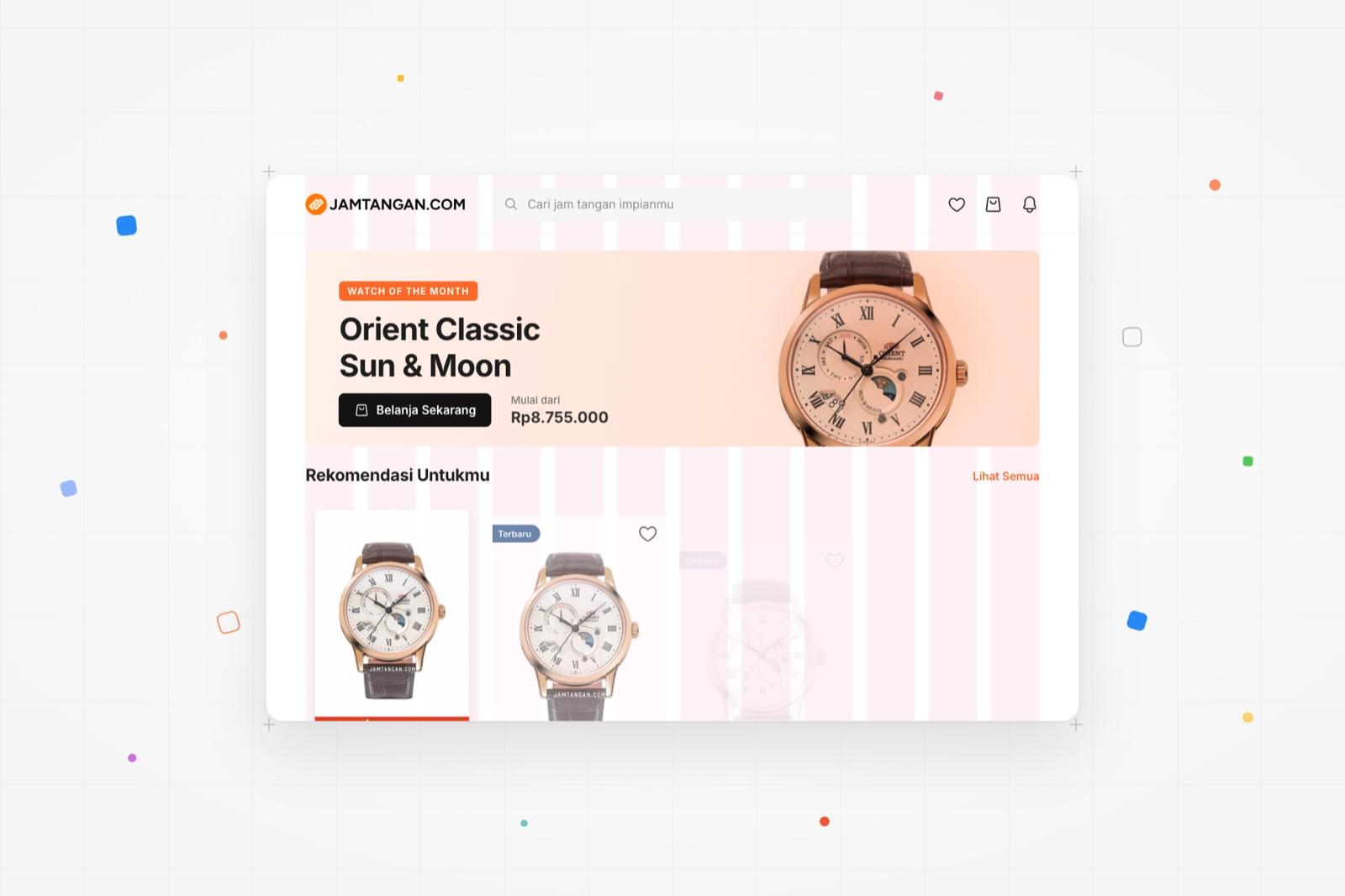
Jamtangan.com had ten years of dark-mode screens, no documentation and developers overriding code to make things fit. I built Movement from zero tokens, 40+ components and a Storybook handoff so the 2025 brand refresh could ship on one shared language.
- Role
- Product Designer - led the system end to end
- Company
- Catalyst Tech, for Jamtangan.com
- Timeline
- 3 months to v1, 2024 - 2025
- 40+
- Components shipped across web and app
- 50%
- Faster development velocity
- 3 mo
- From zero to a working v1
- AA
- WCAG 2.1 contrast on core tokens
Overview
What is Jamtangan.com
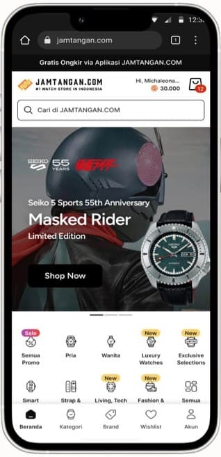
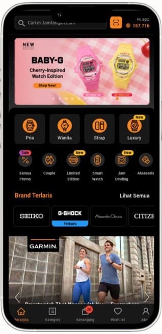
Indonesia's #1 watch store: original watches from 100+ brands, sold online and in physical stores. For a decade it was known for one thing visually - a dark, orange-on-black theme.
What is Movement
Movement is the design language behind Jamtangan.com: tokens, components and guidelines in one place. It is the single source of truth designers and developers build from, and it evolves with the product.
The problem
Ten years, no shared language
I started by auditing live screens next to the front-end code. Buttons looked different on every page, spacing drifted, and text styles didn't match. Developers overrode CSS just to make a screen work, and designers had no documentation to follow.
A new idea for the company
The harder problem wasn't the components. A design system was a new concept here, so stakeholders and developers didn't yet see why it mattered, or how it would pay back the time it took.
Make Movement the single source of truth for every division - so product managers, designers and developers point to the same guidelines and the same assets.
- BELI SEKARANGh32 · r2 · Roboto 700/11
- Beli Sekarangh40 · r8 · Roboto 500/14
- BELI SEKARANGh32 · r2 · outline
- BELI SEKARANGh32 · grey as disabled?
- Gratis Ongkirh34 · r4 · gradient
- LEBIH CEPAT VIA WHATSAPPh30 · r3 · Roboto 700/10
- COD | 1-4 HARIh30 · r0 · mono
The approach
I was the one who pushed for a design system at Jamtangan.com, so the first job was making the case for it - then proving it with something small that worked.
- 01
Audit what exists
Reviewed designs and front-end code side by side to list every inconsistency - buttons, spacing, type - and where developers were patching around them.
- 02
Explain why it matters
Ran sessions for stakeholders and developers on what a design system is, with the timeline and what comes after v1.
- 03
Start small
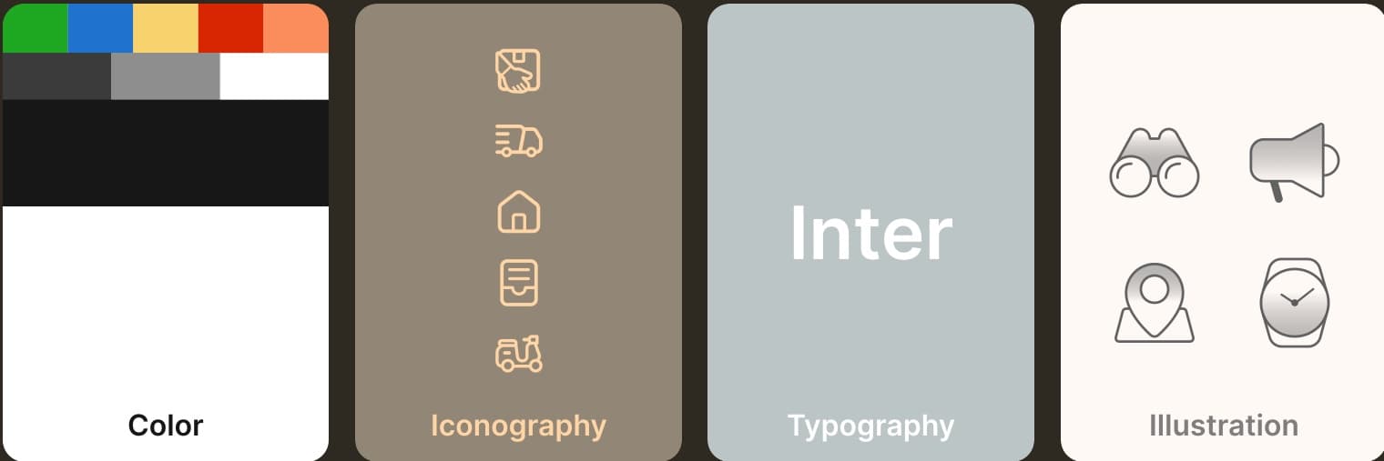
Defined core tokens first - color, type, spacing, radius - then the most-used components like buttons and inputs, with names everyone could read.
- 04
Build with developers
Agreed token and component naming with engineering, held regular check-ins, and kept docs short enough that people actually used them.
Building it
Tokens: value → global → alias
Every decision is a token in three layers. A raw value becomes a global (black.900), and components only ever read an alias that says what it's for (mov.surface.base.black). When the refresh changed the palette, we remapped aliases instead of touching components.
- Value#0C0C0C
- Globalblack.900
- Aliasmov.surface.base.black
Type: Roboto out, Inter in
Inter reads better at small sizes on dense product pages, and its weights give hierarchy without leaning on color. Four weights and a fixed scale, each size paired with its line height.
- H132 / 40
- #1 Watch store in Indonesia
- H224 / 32
- #1 Watch store in Indonesia
- Body14 / 20
- #1 Watch store in Indonesia
- Caption12 / 16
- #1 Watch store in Indonesia
Components, documented where developers work
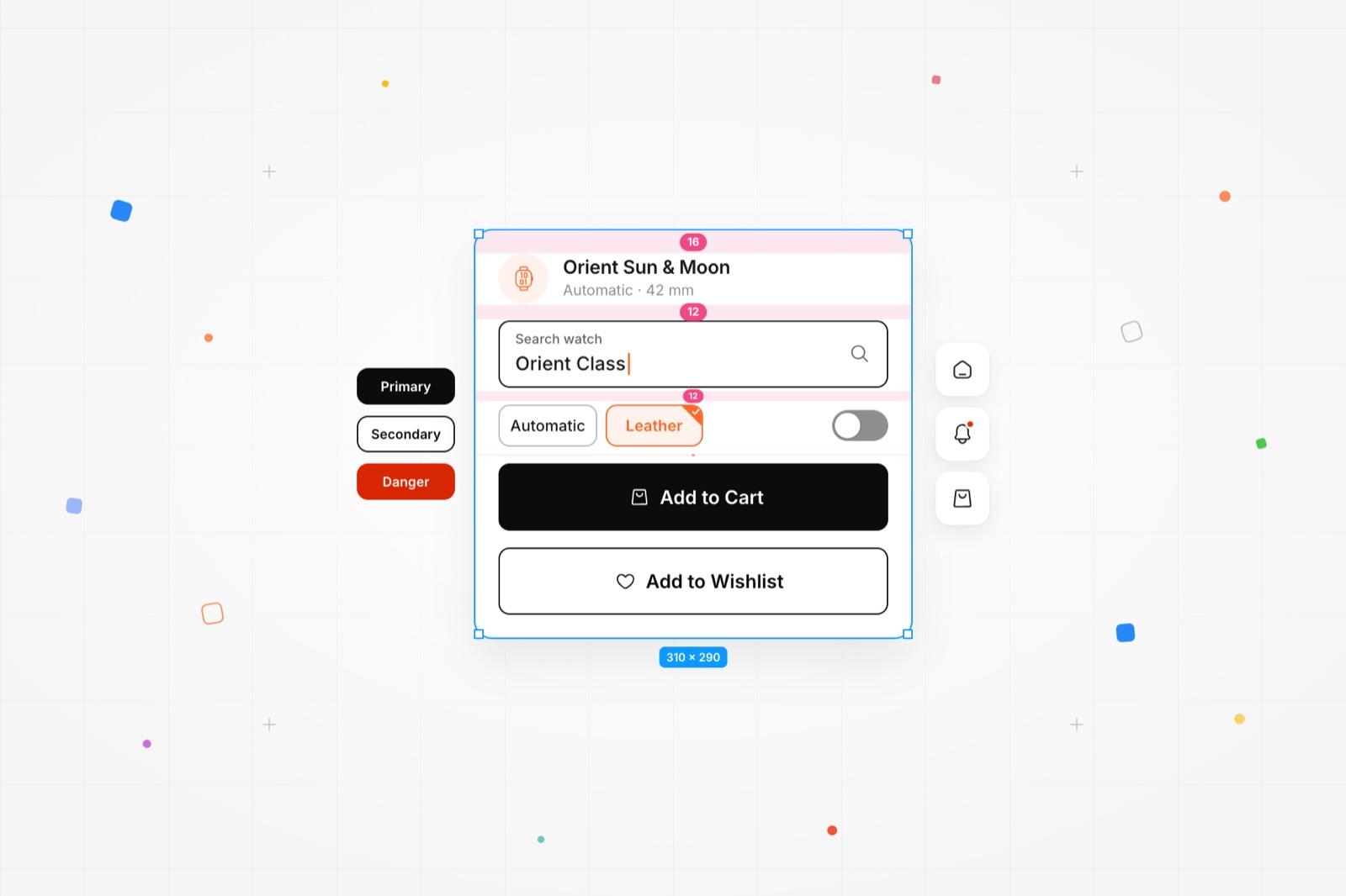
40+ components in Figma, mirrored one-to-one in Storybook. Each ships with its props, states and the tokens it reads, so QA and engineers check the build against the same source designers use.
<Button variant="primary" size="lg" icon="bag">Add to Cart</Button>Impact
Movement closed the gap between design and build. Screens stopped drifting, handoff turned into a shared reference instead of a redline, and the brand refresh shipped on top of it.
- 50%
Development velocity
Engineers assemble from documented components instead of rebuilding them.
- 3 mo
Zero to v1
Tokens, core components and Storybook live within one quarter.
- AA
WCAG 2.1
Core text and surface pairs checked for contrast at the token level.
- 1
Source of truth
Design, engineering, QA and PMs reference the same Figma library and Storybook.
Takeaways
Adoption is the real deliverable
The timeline was tight, and even after walking the team through key components like the top navigation, people forgot the details. I learned to shorten docs, repeat demos and put the system where people already work.
Bring QA in on day one
QA often saw components differently from design and engineering. Involving them from the first discussions would have caught those gaps earlier.
Tokens are how teams agree
Building Movement showed me that consistency and velocity come from shared names more than shared files. It sharpened how I explain systems to people who've never used one.
The team
- Product DesignerAgip Arzaki Maulana
- Product ManagerDesmonda Gracia
- Tech LeadAriyanto Mardi
- Web DevelopersMichaelona Patricia, Aldo Branco, Haska Fikri
- Mobile DevelopersFelix Cary, Taufik Hidayat
- IllustratorRichard Crysna
Next case study
02 / 04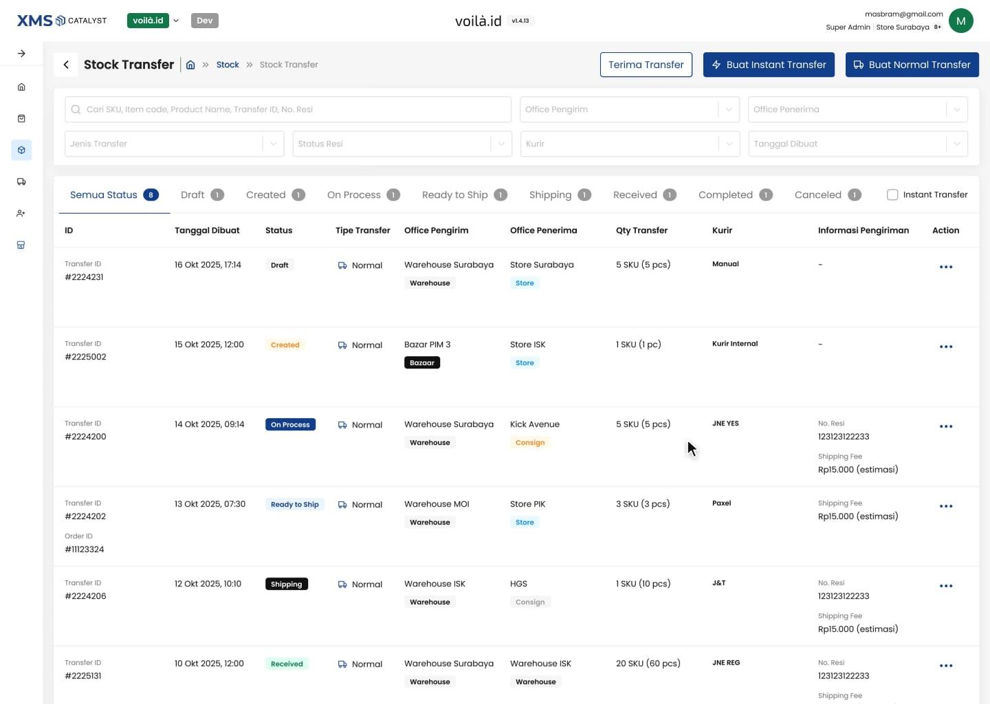
Transfer Stock
One stock transfer module in XMS Catalyst for voilà.id and Jamtangan.com, replacing two tools and two different flows.